Why Are Hindu Gods Blue? -- Color, Cloud, and the Modern Calendar
हिन्दू देवता नीले क्यों हैं? -- वर्ण, मेघ, और आधुनिक कैलेंडर
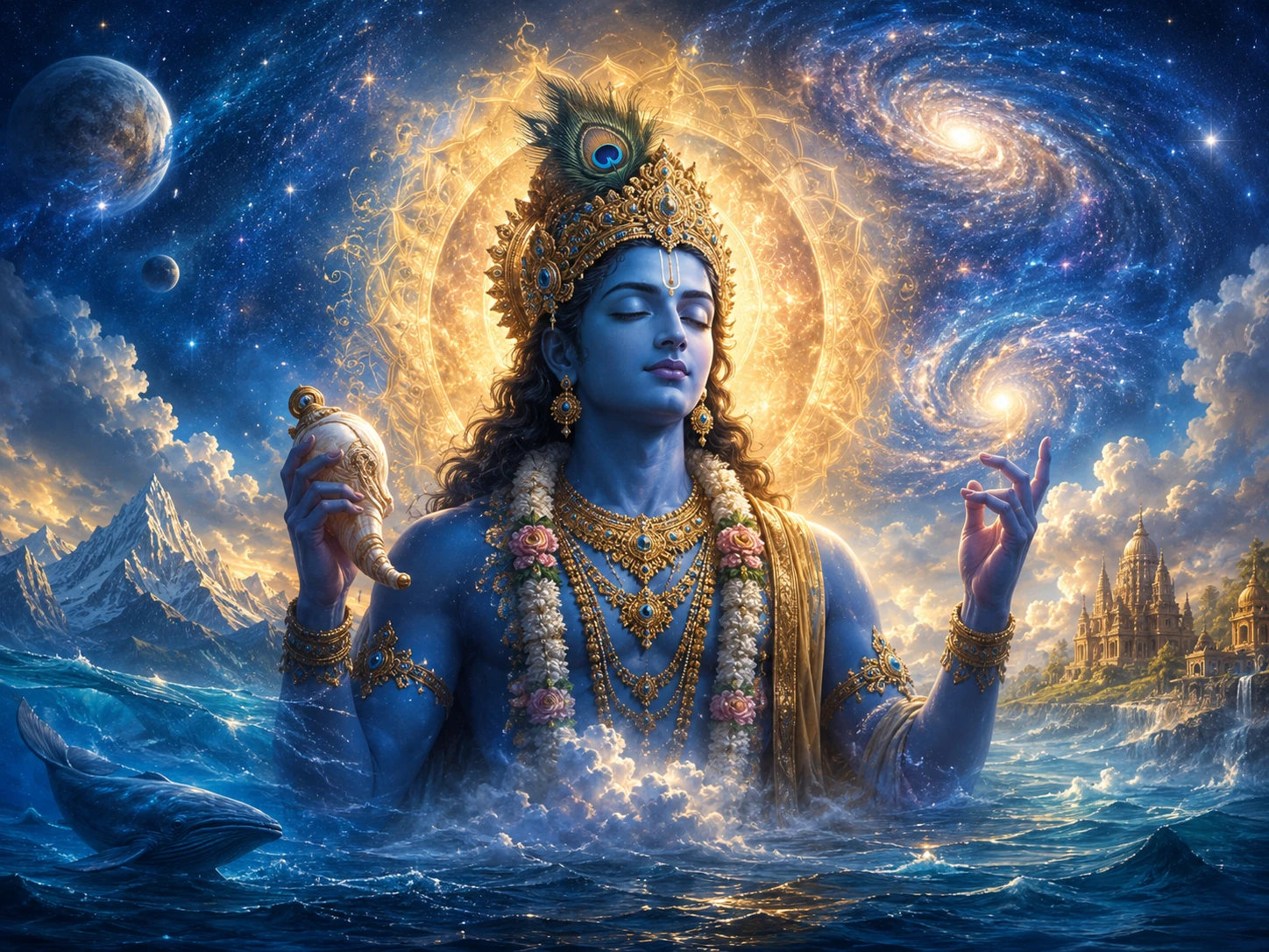
Open Instagram on a Janmashtami morning and Krishna is in luminous turquoise, almost glowing, robes a saturated yellow, peacock feather catching neon light. Open the Bhagavata Purana and the same Krishna is described in a different word: syama. Dark. Like a monsoon cloud heavy with rain. Like the bark of a tamala tree. Like still water under a moonless sky.
Both cannot be the original. One of them is downstream of the other.
The answer is precise enough to date. In 1894, in Girgaum in what was then Bombay, Raja Ravi Varma of the Travancore royal family started a lithographic printing press. Within a decade, this press had pushed millions of mass-produced colour images of Hindu deities into Indian homes for the first time in history. Until then, Indians had encountered their gods primarily through three channels: temple murtis (most often dark metal, blackened by oxidation and ritual oil), Pahari and Rajput miniature paintings (deep slate-grey, charcoal, near-black for Krishna), and oral imagination shaped by recitation. There was no national visual standard.
Ravi Varma created one. His German-imported chromolithography machines could not reliably reproduce the deep cloud-dark of pre-modern miniatures. Saturated colours printed legibly on cheap paper; subtle dusk-tones did not. So Krishna brightened. The skin of Vishnu lightened. Shiva, who in scripture is fair-skinned and ash-covered with only his throat blue, was simplified into uniform blue-grey. Within two generations, Amar Chitra Katha and the Doordarshan television serials had locked these new images into national memory. The Krishna in your school NCERT textbook is a great-great-grandchild of a Ravi Varma print run.
This is not a story of corruption. Calendar art served a real purpose: it democratised access to deity images for a population that had never been able to commission a court painting. But somewhere along the way, the public forgot that calendar art was calendar art and not scripture. The bright blue Krishna on the wedding card is a 1894 invention. The cloud-dark Krishna of the Bhagavata Purana is two thousand years older.
This article is about that gap. About what colour actually means in Hindu iconography, deity by deity. About why the scripture says syama and the screen says turquoise. About the difference between the Krishna at Iskcon Bengaluru and the Krishna at Banke Bihari Vrindavan, and why both are correct for what they are doing.
वेणुं क्वणन्तमरविन्ददलायताक्षं बर्हावतंसमसिताम्बुदसुन्दराङ्गम्। कन्दर्पकोटिकमनीयविशेषशोभं गोविन्दमादिपुरुषं तमहं भजामि॥
veṇuṁ kvaṇantam aravinda-dalāyatākṣaṁ barhāvataṁsam asitāmbuda-sundarāṅgam kandarpa-koṭi-kamanīya-viśeṣa-śobhaṁ govindam ādi-puruṣaṁ tam ahaṁ bhajāmi
I worship Govinda, the primeval Lord, who plays upon the flute, whose eyes are wide and long like lotus petals, who wears a peacock feather as a head ornament, whose body is beautiful like a dark cloud (asita-ambuda), whose loveliness exceeds the loveliness of countless cupids put together.
— Brahma Samhita 5.30
The phrase to keep is asita-ambuda-sundara-angam. Asita means dark, not bright. Ambuda is the cloud that holds water, that gathers before monsoon, that hangs heavy and slate-grey over the Western Ghats in late June. The verse does not say Krishna is blue. It says his body has the beauty of a dark monsoon cloud.
Sanskrit deploys an entire family of words for this colour-not-quite-blue-not-quite-black: syama, asita, krishna, megha, tamala, ambuda, jaladhara, nilotpala. Each word carries a slightly different shade and a different lived association. Syama, the most common Krishna epithet, points to dusk-darkness charged with longing. Megha brings the rain cloud directly. Tamala is the dark wood of an Indian forest tree, a deep brown-black. Nilotpala is the blue lotus, where nila itself can mean dark as easily as it means blue, depending on context. The Mahabharata calls Vishnu nila-megha-syama. The Vishnu Sahasranama returns to syama again and again. The cluster all points to a single visual register: deep, charged, dusk-toned, oceanic, alive with the colour that water and storm make together.
What the cluster does not point to is the saturated turquoise of a 2026 phone screen.
This matters because the Sanskrit imagination did not separate dark and blue the way modern English does. In Sanskrit, the colour of the rain cloud, the colour of the deep sea at evening, the colour of a thundercloud over the ocean, and the colour of Krishna are all one tonal family -- a darkness that contains blue, or a blue so deep it tilts toward dark. The Pahari miniature painters of Kangra and Guler in the 18th century knew this exactly. Their Krishna is slate-grey, sometimes nearly charcoal, with depth and shadow that you can almost smell as approaching rain. The Mewar miniatures of the 17th century used lapis lazuli ground into a pigment that approached navy-black. The Bengal Kalighat scrolls of the 19th century painted Krishna in dense, opaque, ink-toned darks. None of these traditions painted Krishna in turquoise. The shift to bright blue is barely 130 years old.
The print revolution that changed all this began on the advice of a single bureaucrat. Sir T. Madhava Rao, former Dewan of Travancore, wrote to Ravi Varma in the 1880s suggesting he produce mass prints. Ravi Varma agreed slowly. The Ravi Varma Fine Art Lithographic Press opened in Girgaum in 1894, with German chromolithographic machines and a German printer named Fritz Schleicher who would later buy the press outright in 1901. The first chromolithograph it produced was Birth of Shakuntala. Soon after came Lakshmi, Saraswati, Ganesha, Vishnu, and the various avataras.
What Ravi Varma did was not malicious. It was technical. Chromolithography uses a separate stone for each colour, hand-drawn. Producing the cloud-dark complexion of the Pahari tradition required four to five overlapping dark-tone stones to capture depth, plus careful overprinting. This was expensive and slow. A single saturated blue stone, by contrast, was fast and reproducible. So the cloud-dark flattened into a uniform blue. Ravi Varma had also trained in European academic oil painting, which used a Renaissance palette where saturated colours signalled importance and presence. Importing that palette to Indian deities produced bright, life-like, almost theatrical figures -- which is precisely why the public loved them. The prints sold in millions. The press at Girgaum moved to Ghatkopar in 1898 (during the Bombay plague), then to Malavli near Lonavala in 1899, where it operated for decades.
By the 1920s and 1930s, every Hindu home in urban India had a Ravi Varma print or one of its imitators. The Poona Chitrashala Press, the Calcutta Art Studio, and the Bombay City Press all copied the formula. By the time Anant Pai launched Amar Chitra Katha in 1967, the Ravi Varma look was simply what Krishna looked like. Pai's illustrators inherited the bright-blue convention without questioning it. Two decades later, Ramanand Sagar's Ramayan (Doordarshan, 1987-1988) and B. R. Chopra's Mahabharat (Doordarshan, 1988-1990) put the same bright-blue divinities on a national television screen for an audience of an estimated 100 crore viewers across the original broadcast and reruns. The aesthetic was now sealed.
This is the entire genealogy of a recognisable image. A single Travancore painter, a single German printer, a single press in Bombay. From there to the entire imagination of a billion people about what their gods look like. The cloud-dark Krishna of the Bhagavata Purana never disappeared. He simply became invisible to public memory, except in the temple traditions that had never updated -- Banke Bihari in Vrindavan, the Jagannath of Puri (entirely unique in iconography), the dark stone Vishnu of Tirupati, the dark metal Krishna of Guruvayur.
Canonical Complexion of Major Hindu Deities
| Deity | Sanskrit complexion | देवनागरी | Source |
|---|---|---|---|
| Vishnu / Krishna | syama, asita-ambuda, nava-megha-syama -- dark, like a fresh rain cloud | श्याम, असितअम्बुद, नवमेघश्याम -- मानसून के मेघ-सा गहरा | Brahma Samhita 5.30; Bhagavata Purana 10.30.4 |
| Rama | nilotpala-dala-syama -- dark like a blue lotus petal | नीलोत्पलदलश्याम -- नीलकमल के पत्ते-सा श्याम | Valmiki Ramayana |
| Shiva | gaura, dhumra, bhasmanga, sphatika-suddha -- fair, smoke-grey, ash-bodied, crystal-pure (only the throat is nilakantha) | गौर, धूम्र, भस्मांग, स्फटिकशुद्ध -- गोरा, धुएँ-सा, भस्म-लिप्त, स्फटिक-निर्मल (केवल कण्ठ नीलकण्ठ) | Shiva Purana; Linga Purana |
| Kali | krishna, asita, ghora-rupa -- intense black, dark like a storm cloud | कृष्ण, असित, घोर-रूपा -- घनतम कालिमा, तूफ़ानी मेघ-सी श्याम | Devi Mahatmya 7.6; Kalika Purana |
| Saraswati | subhra, sveta, hima-vat -- white, snow-pure | शुभ्र, श्वेत, हिमवत् -- श्वेत, हिम के समान निर्मल | Saraswati Stotra; Sri Sukta context |
| Lakshmi | hema-varna, padma-varna -- golden, lotus-pink | हेमवर्णा, पद्मवर्णा -- स्वर्ण-वर्णा, कमल-वर्णा | Sri Sukta (Rig Vedic appendix) |
| Ganesha | rakta-varna, sindura-varna -- red, vermillion | रक्तवर्ण, सिन्दूरवर्ण -- रक्त-लाल, सिन्दूरी | Ganesha Atharvashirsha |
| Hanuman | sindura-varna, rakta -- vermillion red | सिन्दूरवर्ण, रक्त -- सिन्दूरी रक्त-लाल | Sundarakanda; Hanuman Chalisa tradition |
| Surya | rakta-tamra, tapana -- copper-red, blazing | रक्ततामर, तपन -- तप्त ताम्र, ज्वलन्त | Surya Ashtottara; Aditya Hridayam |
Sources are indicative -- most major deities have multiple textual descriptions across different Puranas, Tantras, and stotras. The pattern that holds across sources is that no major Hindu deity is described in scripture as the bright turquoise of modern calendar art. The cluster around Vishnu / Krishna is consistently dark-cloud-toned. Shiva's body is consistently fair or ash-grey, with only the throat blue. Kali is consistently black, not blue. The shift in popular imagery is a 19th and 20th century reproduction history.
नमस्ते रुद्र मन्यव उतो त इषवे नमः। नमस्ते अस्तु धन्वने बाहुभ्यामुत ते नमः॥
namaste rudra manyava utota iṣave namaḥ namaste astu dhanvane bāhubhyām uta te namaḥ
Salutations to you, Rudra, to your wrath and to your arrow. Salutations to your bow, and to both of your arms.
— Sri Rudram, Krishna Yajurveda, Taittiriya Samhita 4.5.1 (the opening verse of the Shatarudriyam, recited daily across Shaiva temples)
The Sri Rudram is the most ancient continuous source of Shiva-prayer in living Hindu practice. It comes from the Krishna Yajurveda's Taittiriya Samhita, recited every morning in Shaiva temples from Kashi to Tiruvannamalai for two and a half millennia. What it does not do, anywhere in its eleven anuvakas, is describe Rudra as blue.
The colour vocabulary for Shiva runs in a different direction entirely. He is gaura, fair-skinned. He is dhumra, smoke-grey, the colour of cremation-ground ash before it is wet. He is bhasmanga, ash-covered, and bhasma-bhushita, ash-adorned -- the body white-grey from ritual application of vibhuti from the sacred fire. The Linga Purana goes further: he is sphatika-shubhra, crystal-clear-pure, and one description compares him to a snow-covered mountain (Kailasa-sannibha). The Mahanarayana Upanishad calls him purusha-sukta-vadya -- the Purusha to whom the great Vedic hymn is offered, beyond colour entirely.
The one place where Shiva is blue is precisely localised. His throat alone is nilakantha, blue-throated, because of the Halahala poison he drank during the Samudra Manthana. Parvati pressed her hand on his throat to stop the poison from descending; the poison stayed in his throat, turning it blue. The pre-modern miniature tradition kept this distinction visually intact. Look at any Pahari Shiva painting from the 18th century: the body is fair, ash-white-grey, the matted hair coiled around the moon, the third eye on the forehead, the deep blue confined precisely to the throat -- a single dark band where Parvati's hand fell. This is iconographically correct. The all-blue Shiva of modern calendar art is a flattening of this distinction. Once chromolithography could not reproduce subtle ash-grey on cheap paper, the throat-blue migrated outward and became the body-blue.
Kali is the inverse case. Her name itself contains the answer: kālī from kāla, time and also black. The Devi Mahatmya describes her emerging from Durga's brow during battle with the asuras Chanda and Munda, with skin like a storm cloud, hair undone like a hurricane, tongue out, garlanded with severed heads. The texts use krishna and asita -- both translatable as black. The modern Kali, especially in Bengali Kalighat painting and later print art, often becomes dark blue rather than absolute black, partly because pure black is hard to print on paper without losing facial features, partly because dark blue carries the same emotional charge while remaining legible. But scripture is unambiguous: Kali is black, not blue. The blue is a printing-press accommodation.
The first chromolithograph ever produced by the Ravi Varma Press in 1894 was not a deity image but Birth of Shakuntala -- a scene from the Mahabharata. The deity prints came shortly after: Lakshmi and Saraswati in September 1894, then Vishnu and Krishna and the various avataras through 1895 and 1896. By the time of Ravi Varma's death in 1906, his press had circulated more deity images than the entire pre-modern miniature tradition combined had produced in five hundred years. The Krishna whose form most Indians today recognise was, in a real and traceable sense, born in Bombay between 1894 and 1906.
Step away from Krishna and Shiva for a moment, and the colour vocabulary widens further. Each deity in the Hindu pantheon carries a distinct chromatic signature, and these signatures survived the print revolution more or less intact -- precisely because they were already saturated and reproducible.
Saraswati is shubhra, sveta, hima-vat -- white, snow-pure, the colour of dawn before the sun strikes. The Saraswati Stotra opens with ya kundendu-tushara-hara-dhavala -- white as kunda flower, moon, mist, garland of pearls. Her white is not absence but accumulation, the way fresh snow holds every colour of dawn folded into itself. Painters across traditions, from Tanjore to Pahari to Ravi Varma, kept Saraswati in white robes seated on a white lotus or swan because the scripture leaves no ambiguity. White is sattva -- clarity, learning, the still mind.
Lakshmi is hema-varna, padma-varna, suvarna-prabha -- gold, lotus-pink, with the lustre of pure gold. The Sri Sukta, attached to the Rig Veda as a khila and recited in every Lakshmi puja from Bengali Lokkhi Pujo to Tamil Varalakshmi Vratam, calls her hiranya-varna and hiranya-prakara. The gold is literal in temple iconography -- her brass and gold-leafed murtis are made to glow under oil-lamp light during Diwali, when small Lakshmi images appear in every shop on Bengaluru's Commercial Street and Chennai's T. Nagar.
Ganesha is rakta-varna and sindura-varna -- red and vermillion. The Ganesha Atharvashirsha invokes him as rakta in body, with sindura-rasa applied. The bright red of the Pune Lalbaugcha Raja during Ganesh Chaturthi, the saffron-vermillion smear on the household Ganesha murti before any new venture begins, the red sindura tilaka on the elephant forehead -- all canonical. Hanuman shares this red. The Sundarakanda describes him as sindura-prabha, the colour of the rising sun. Modern Hanuman temples across India keep him deeply vermillion, sometimes nearly orange-red, often with a fresh layer of sindura applied by devotees on Tuesdays.
Surya, the sun deity, is rakta-tamra and tapana -- coppery-red, blazing. The Aditya Hridayam recited by Rama before his battle with Ravana describes Surya in incandescent red-gold, never blue, never dark. The Konark Sun Temple sculpted his form in deep red sandstone for exactly this reason; the original chariot of seven horses was meant to be bathed in dawn's coppery light. Modern Sundays carry the same colour-association unconsciously: red roses for Surya, copper vessels for Surya arghya, vermillion sindura for the sun-rise puja that some Brahmin households still keep.
The pattern that emerges across the pantheon is not arbitrary. Each deity's colour is woven into the textual descriptions, the bija-mantra, the meditation practice (dhyana shloka), and the pigments traditionally used in temple murti consecration. Where calendar art has drifted is mainly in the dark-toned deities -- Vishnu, Krishna, Shiva, Kali. The reproducible saturated colours -- gold, white, red -- survived intact, because the print machines could handle them. The cloud-dark and the ash-grey did not survive, because they could not be printed cheaply. What looks like a coherent calendar-art pantheon is partly a print-technology artefact: the deities the press could render are the deities you remember.
Why does scripture assign colour at all if the absolute is formless? The Bhagavad Gita 12.5 gives the classical answer: the path of those who pursue the Unmanifest is harder for embodied beings, because the Unmanifest is difficult to grasp through senses and mind. So the divine gives form. Colour is one feature of that form. It is upaya -- skilful means -- not metaphysical fact.
Within tantric meditation, the colour-symbolism becomes more technical. Each deity is meditated upon with prescribed visual attributes that match the bija mantra and the practical effect of the practice. White goddess for sattva, learning, peace -- Saraswati. Gold goddess for prosperity and abundance -- Lakshmi. Red goddess for energy, power, victory -- Durga in her warrior forms, Tripura Sundari. Black goddess for dissolution and absolute reality -- Kali, Tara. These mappings make sense within Shakta tantra, where Mahadevi takes three or five colour-coded forms (Mahalakshmi-sattva, Mahasaraswati-rajas, Mahakali-tamas, in the Devi Mahatmya formulation). They do not extend cleanly to all Hindu deities, and applying them outside Shakta tantra without saying so is sectarian.
The popular trimurti formula -- Vishnu sattva, Brahma rajas, Shiva tamas -- is specifically a Vaishnava framing, found in Vaishnava puranas and bhakti literature. Saiva tradition rejects this. In Saiva theology, Shiva is beyond gunas: nirguna, the witness, the substrate on which the gunas play. Shakta tradition similarly holds Mahadevi as beyond gunas. Calling Shiva tamas because he is associated with dissolution-energy is correct in one sectarian frame and incorrect in another. The honest description is that the trimurti-guna mapping is one tradition's view, not a pan-Hindu consensus.
For the practitioner, the prescribed colour matters because it shapes the inner image and therefore the inner state. Meditate on white Saraswati and the mind takes a particular kind of clarity. Meditate on red Tripura Sundari and the mind takes a particular kind of intensity. Meditate on dark Krishna and the mind takes a particular kind of intimacy and longing. The colour is not arbitrary; the colour is the practice. For the philosopher, no colour is final, because the absolute itself is colourless. Both views are true at different levels of approach. The scripture covers both.
Walk through the Iskcon temple in Bengaluru on Janmashtami and Krishna stands in luminous turquoise, surrounded by neon-lit floral arrangements, sound systems carrying the kirtan to a parking lot full of techies who came after work. Walk through the Banke Bihari temple in Vrindavan on the same day and the deity is much darker -- a deep coal-black, almost lost in the dim oil-lamp light, the priests revealing him only for moments at a time before sliding the curtain shut. These two temples represent two coherent and ancient image traditions, layered onto the same evening, the same festival, the same scripture.
The Iskcon Krishna inherits the Ravi Varma to Amar Chitra Katha to ISKCON-publishing house lineage of accessible mass devotion, designed for visibility in low light, designed for photographs, designed for a lay devotee who needs the deity to be clearly recognisable. The Banke Bihari deity inherits the medieval Braj tradition where dark is the point. The temple is dim because Krishna in the mood of meeting Radha at dusk is a private deity, not a public one, and the curtain stays half-closed because the encounter is meant to be brief and unbearable. Both temples are correct for their respective theological purposes.
This distinction lands daily in modern Indian lives. A Bengaluru engineer's daughter brings home an NCERT textbook with bright-blue Krishna and asks a question her grandmother cannot quite answer -- the grandmother grew up with a different Krishna in the family puja-room, a near-black brass murti darkened by generations of oil. A Pune NEET aspirant takes a study break and watches a clip of Sagar Ramayan on YouTube; the visuals lock the bright-blue Rama into her mind during the most cognitively impressionable hours of her day. A Chennai NRI returning from Boston for Janmashtami visits her ancestral village temple and feels a small shock at how dark the deity actually is, compared to the bright-blue Krishna app icon her cousin in California uses for daily meditation reminders. None of these experiences is wrong. They are downstream of three different image traditions running in parallel: the temple murti tradition (often dark by metal, oxidation, and ritual oil), the calendar print tradition (Ravi Varma onwards, bright blue), and the digital avatar tradition (smooth gradient, Instagram-friendly turquoise, Spotify devotional playlist cover art).
The scripture position is the simplest. When the Bhagavata Purana says syama, the Bhagavata Purana means dark like a monsoon cloud. When the calendar shows turquoise, that is calendar art -- aesthetically powerful, historically recent, devotionally useful, but not a correction of scripture. The two can coexist in a careful Hindu's understanding without any conflict. What does not work is letting calendar art pretend to be scripture. The Instagram graphic that says 'Krishna is blue because blue symbolises infinity' is well-intentioned but builds the symbolism on a colour scripture never actually assigns. The deeper symbolism -- syama as dusk, as monsoon cloud, as the deep that contains everything before form arrives -- is older, richer, and more accurate than the post-1894 retrofit.
Meditate on Syama-Krishna -- the Cloud-Dark Form
A guided 10-minute visualisation of Krishna in his scriptural complexion -- syama, like a monsoon cloud over the Yamuna at dusk. The deeper darkness changes what arises in the mind compared to the bright-blue calendar image. Try it once, then compare.
Tags
Eternal Raga · शाश्वत राग
Institutional voice — scholarly articles on Sanatan Dharma
The first chromolithograph ever produced by the Ravi Varma Press in 1894 was not a deity image but Birth of Shakuntala -- a scene from the Mahabharata. The deity prints came shortly after: Lakshmi and Saraswati in Septem…
More in Sacred Symbols
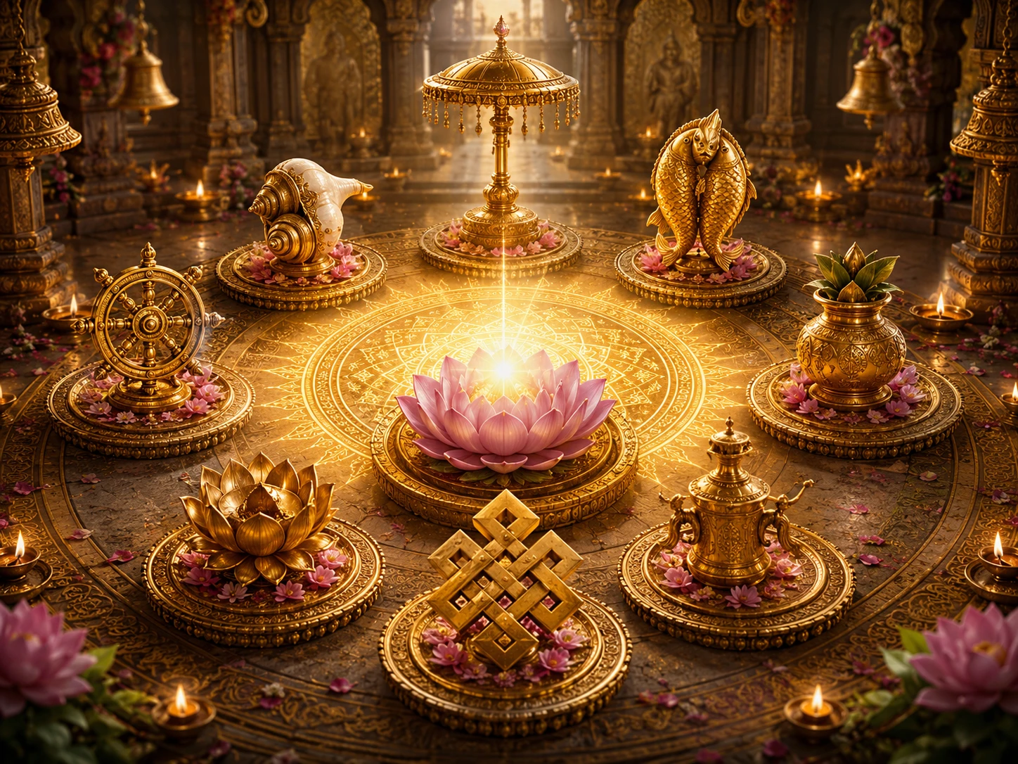
Ashtamangala -- The Eight Auspicious Symbols of Hindu Tradition
13 min read
Bindu -- The Point from which Creation Emerges
12 min read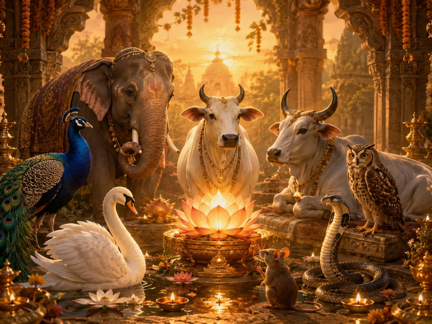
Gau -- Why the Cow Holds the Place She Does in Hindu Life
14 min readThe same translation error that turned '33 Koti' into '33 crore' in Hinduism also happened in Buddhism. The Chinese translation of Buddhist texts rendered 'Sapta Koti Buddha' (7 Supreme Buddhas) as '7 Crore Buddhas.' The…
Deities AvatarsCommunity Reflections
🕉️
Be the first to share your reflection.